How to prepare for a side project
Plan for: Idea -> Prototype -> Design -> Code -> Infrastructure -> Deployment
👋 Hey! This is the first issue of the newsletter series for building a side project. In this issue, we’ll discuss how to create a design system (even if you’re not a designer) and pick a tech stack that leverages your strengths to ship fast and allows you to learn simultaneously.
In the next issue, we’ll discuss coming up with an idea, prototyping it without coding to see the pain points and creating a refined design.
I’m excited for you to come along on the journey!
Motivation
I find that building side projects is the best way to learn new skills. Working with the current technologies and workflows that your company is using is great, but sometimes you need to experiment way out of your comfort zone to grow.
My motivation with this project is to:
Learn more about UI/UX design
Learn infrastructure (AWS)
Learn backend (Node.js with Next.js)
Creating a design system
UX tips for developers
When I start a new project, I like to create a design system first. This gives me building blocks for the idea. If the idea has to evolve and change I can rearrange the design system to match the changes.
It’s like having Lego blocks instead of one plastic toy. You can make whatever you can imagine as opposed to playing with one toy.
Informational architecture (IA)
Start with a birdseye view of your app
Before I start designing an app, I always start with information architecture. This gives me a map of all the pages and functionality I have to design.
Here’re some tools I like for creating IA maps:
Miro
Mindnode
Figjam by Figma
Creating a colour palette
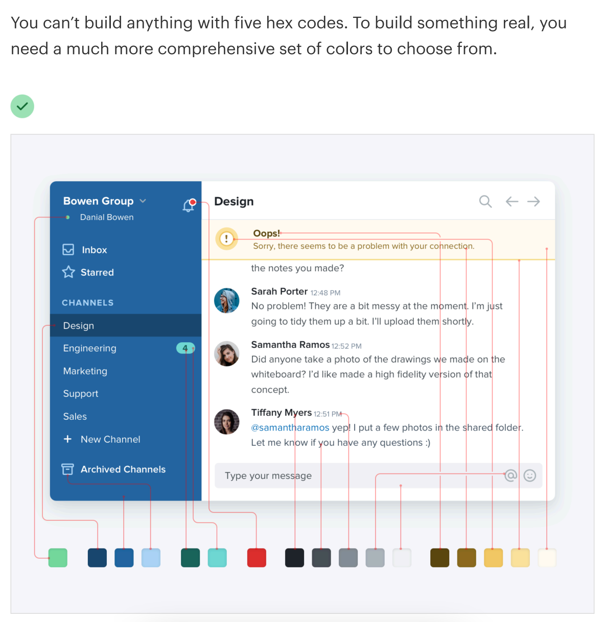
You might need more colours than you might think
There are two schools of thought when it comes to building colour palettes. Some people say that you should only add new colours as the need arises, while others say that you should predefine a colour palette ahead of time.
Personally, I’m leaning towards the second camp. It makes my job easier as a developer to know all possible colour combinations.
Step 1. Inspiration
I used Chat GPT to spark my imagination for a colour palette.
Some other ways I like to get ideas for colours:
Google cold/warm colour sets based on what I’m building. Warm sets for blogs, cold for professional apps.
Take a photo of a building or an object I like and grab colours from it in Figma. I find those exterior designers often put a lot of effort into creating colour palettes, so it’s sometimes possible to take them from a photo and use it for a design.
Step 2. Selection
I put the colours suggested by Chat GPT to Figma and selected the one I liked the most (Spring Green).
Step 3. Choose complimentary tones for building your UI.
Neutral:
Dividers, borders between layout sections and UI components.
Success:
Used for badges, snack bars and toasts for successful operations in your app.
For example: “Purchase order successful”.
Warning:
Used for operations that should notify the user about a warning of an action that will have to be done soon.
For example: “Link expires in 24 hours”.
Dange:
Used for operations that have failed
For example: “Failed to reset password”.
Step 4. Tailwind setup:
Add your colour palette to tailwind.config.js. This will generate a complete, mobile-first design system for your app.
colors: {
        primary: {
          1: '#00D369',
          2: '#00FF7F',
          3: '#57FFAB',
          4: '#6FFFB6',
          5: '#A7FFD3',
          6: '#D3FFE9',
          7: '#D9FBEA',
        },
        neutral: {
          1: '#202732',
          2: '#616878',
          3: '#8990A4',
          4: '#B6C2CD',
          5: '#CED2DC',
          6: '#E2E6EB',
          7: '#F5F5FA',
        },
        success: {
          1: '#1C4041',
          2: '#2D635A',
          3: '#448F87',
          4: '#57A89F',
          5: '#84D5D2',
          6: '#B1E9EB',
          7: '#EAFFFA',
        },
        warning: {
          1: '#584915',
          2: '#886C27',
          3: '#C4A947',
          4: '#EBCC6D',
          5: '#F7E4A0',
          6: '#F9F1D9',
          7: '#FFFBF1',
        },
        danger: {
          1: '#591B15',
          2: '#7F251B',
          3: '#A93122',
          4: '#CF4131',
          5: '#D66D66',
          6: '#EDAEAB',
          7: '#F8E7E6',
        },
      },
Typography
Choosing the right font for your app is crucial. A font that’s hard to read can make all your design look bad, no matter how much time you spend on it.
Here’re some tips that I’ve found helpful for creating typography systems:
Pick a font that matches your brand.
Are you going for something playful? Minimal? Corporate? Pick the best matching font for your case.
If in doubt, stick with the well-known fonts: Arial, Helvetica, Helvetica Neue, and Inter. Many of these points have been around for decades and for a good reason.
💡Bonus: if you pick system fonts, they will often be cached in your user’s devices, loading your app faster.
Create a font-size system for your app. Don’t create font sizes on the fly, as it will make your UI look inconsistent.
In the example below, I’ve picked a font named Matter. It’s a font I haven’t tried before, but I used a typical font size scale. Here’s an example below.
These sizes should cover all possible cases an app could have. From tiny tooltip texts to large heading texts for a landing page.
Iconography
When choosing iconography, make sure to choose a set of icons that work well with your font. Some of the things that I look for to see if they’re matching:
How rounded (border-radius) are the fonts vs icons are
Sharp fonts don’t work well with rounded icons
How heavy are the icons are
Make sure that the font-weight is similar for both icons and fonts.
Are the icons filled or empty
Step 1. Choose an icon library
For this app idea, I went for Radix Icons. It’s a free, open-source icon library.
If you would like to use different icons for your project, here’s a link with 50 + free icon packs: https://www.toools.design/free-open-source-icon-libraries
Step 2. Define sizes ahead of time
I find that having consistent icon sizes saves a lot of time down the line when designing components.
📖 Creating a design system TL;DR
You can create your own design system by following these steps:
Start with Information Architecture (IA)
Think about your page structure (/login, /register, /app…)
See your app from birds eye view (where you have to put the most effort in designing)
Create your colour pallette
Pick the main brand colour.
You need more tones than you might think
5-7 tones primary tones
Neutral tones
Action tones:
Warning
Success
Error
Prepare colour variables to be used in CSS
Typography
Pick clear, tested fonts
Use a consistent font-size scale
Iconogrophy
Pick an icon pack that matches your font
Predefine icon sizes for your design
Choosing a tech stack
Choosing a well-balanced tech stack is one of the keys to shipping a successful project. Here’re some factors I would consider when selecting technologies for a tech stack:
Your knowledge level. How fast can you work with these technologies?
Adoption level. How large is the community around the technology?
Check GitHub issues, are they answered quickly?
Does the technology have a community hub like a Discord server?
Who can you turn to if the technology is not working well?
Learning potential. Are you learning something new with your stack?
My advice would be: don’t learn parallel technologies (technologies that solve the same problem).
For example, if you already know React.js, don’t learn Vue.js. Instead, learn something like Next.js.
Go deeper, not broader, in your learning.
That being said, here’s a stack I picked for this project:
Backend
Framework: Next.js
Features: App Router, Server actions, REST API
Why I chose it: Next.js makes it easy to build REST APS by writing TypeScript. Also, I want to test how far I can take Next.js Server Actions (calling mutations to the server without building an API).
Authorization: AWS Amplify
Single sign-on (SSO): Google
Why I chose it: There’re many authorization providers like NextAuth or LuciaAuth designed for Next.js specifically. But for this project, I want to focus the stack around AWS.
Database: AWS RDS
Type: Relational
Why I chose it: Relational databases emphasise data structure as opposed to flexibility. For this project, I’ve picked it over a non-relational database like Mongo DB for simplicity's sake.
I went with AWS RDS to stick with the AWS stack and try out a cloud-managed database instead of running my own MySql instance.
Frontend
Framework: React.js
Features: RSC - React Server Components, JSX, Virtual DOM
Why I chose it: As of now, React is the most popular UI framework. It has a huge ecosystem as it’s been out for over 10 years. Also, I have the most experience in React as opposed to other frameworks, so I picked it to develop faster.
Meta framework: Next.js
Features: App Router, bundle splitting, image optimization
Why I chose it: Next.js is my favourite way to write React.js. Some members of the core team of React.js are now working on Next.js, and in my experience, it is the best way to write production-grade apps with React.
It will handle routing, request deduping and optimize the app’s performance.
Styling framework: Tailwind CSS
Features: Design system, scalable CSS, tree-shaking
Why I chose it: 3 years ago, I started writing my CSS using Tailwind, and I’ve never looked back. In my experience, building UIs using is your best bet to make your CSS codebase scale.
Accessibility framework: Radix
Features: Keyboard controls, screen-reader support
Why I chose it: Recently, I’ve been focusing more on making sure my UIs are more accessible. Radix is an excellent tool for that as achieving through accessibility (for example controlling modals with a keyboard) is challenging and time-consuming.
Radix doesn’t assume how you want to style your app. It adds the accessibility layer and leaves the design and styling up to you.
UI components: shadcn UI
Features: Beautifully designed UI components for Tailwind and Radix
Why I chose it: shadcn UI provides a large selection of UI components like accordions, tables, inputs, and modals. At the same time, it makes it easy to customize their styling in case I want a more custom feel to my app.
Charts: recharts
Features: Customizable charts and tooltips based on D3
Why I chose it: I’ve been researching chart libraries for React and from what I could find, recharts has the broadest offering of charts. It also has a large community on GitHub.
Forms: React Hook Form
Features: Form error handling, complex form state
Why I chose it: Handling form validation, warning and error states manually can be a lot of work. I love using tools like React Hook Form or Formik to handle that automatically.
SSR Hydration: React Query
Features: Prefetch data on the Next.js server, hydrate, reactive data hooks, mutations, optimistic UI
Why I chose it: Working with asynchronous data is a common task in frontend codebases. React Query is my favourite way to do it.
Linting: Eslint, prettier
Features: Enforce code style, autoformat the code
Why I chose it: Eslint and prettier and are essential fro all projects IMO. Agree with the code rules once in your team and use the same roles across the different projects instead of arguing about code styles in each merge request.
Type syntax: TypeScript
Features: Add static types to JavaScript
Why I chose it: I find that I can code faster with TypeScript because I can separate data types and structures from logic easier. This helps writes code that has fewer bugs.
Type schema: Zod
Features: Declare and validate type safe schemas, works on server and client
Why I chose it: Validate user inputs, endpoints, and actions. It’s super hand when you need to validate a nested object values.
Infrastructure
Hosting: AWS
Features: Lambdas (server functions), CDNs
Why I chose it: There’re great solutions like Vercel for handling serverless apps. However, I want to learn more about the backend and infrastructure and further learn AWS.
DNS: Namecheap
Features: Buy domains, assign hosting
Why I chose it: Namecheap had better prices when I was looking. Another great option to buy domains is Godaddy.
CI/CD: GitHub
Features: Git hosting, pull requests, GitHub Actions
Why I chose it: I’m already using GitHub for my personal projects, so I wanted to learn it better by adding CI/CD to a GitHub repository.
📖 Choosing a tech stack TL;DR
How to choose technologies:
Your current knowledge (for development speed).
Community support (if you need help).
Learning potential. Are you learning new concepts or the same concepts but in a different way?
Your stack should cover:
Backend
Frontend
Infrastructure
Summary
Thanks for reading!
In the newsletter issue, we’ve discussed creating a design system and picking technologies that allow you to work fast while shipping great quality products.
See you in the next newsletter issue!
Further reading:
Refactoring UI https://www.refactoringui.com/
Make your ideas look awesome, without relying on a designer.
Learn how to design beautiful user interfaces by yourself using specific tactics explained from a developer's point-of-view.


great work, hope to see more of these in the future, looking to build my own micro SaaS app as a side hustle. Keep up the good work.