Coding an MVP for a side project
Rolling the sleeves and working with web development
Intro
👋 Welcome to part 3 of the newsletter series about building a web app side project!
In the previous issue, we discussed developing a side project idea, validating it without code and designing it.
In this issue, we’ll get to the actual building of the app. I had a lot of fun turning a static design into a working app, I hope you’ll enjoy this process too!
Table of contents
ts-jest
End result
This is the progress of the app I’m building so far. It took me roughly 20 hours of work.
What is an MVP?
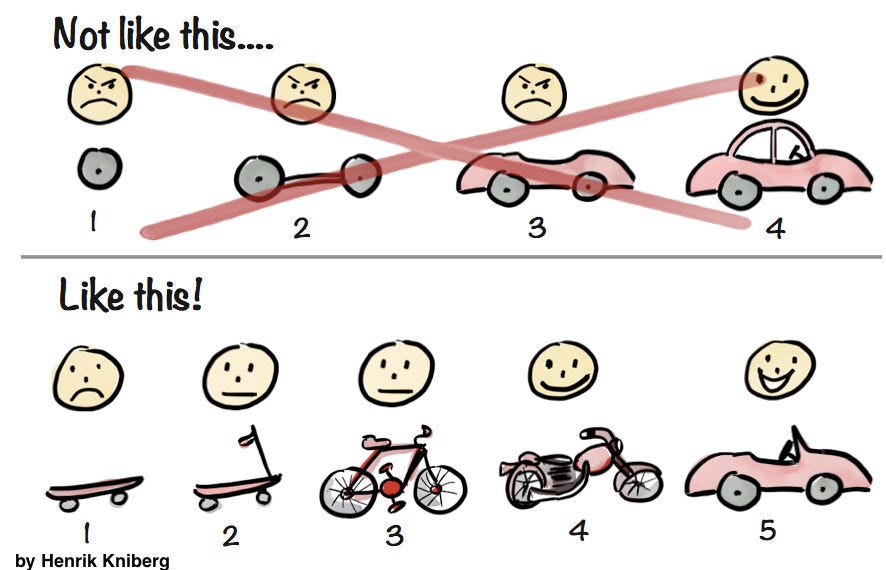
All IT projects tend to fall into “feature creep“. It’s when you want to add more and more functionality before releasing the functionality planned earlier. This can be bad as it will put you into continuous development without seeing if your ideas solve a problem for the users.
Increase velocity with the MVP approach
MVP stands for “minimal viable product“. It’s a version of an app that has less functionality than your full app but still can solve a problem for the user.
💡 The key when developing your apps using the MVP approach is to ship something functional with each iteration.
Here’re the features I implemented in the first iteration of my app:
Describing a decision
Creating options that could solve that problem
Ability to delete an option
Rating options using these factors:
Financial cost
Level of effort
Time investment
Risk
Short term return
Long term return
See long-term return versus risk tradeoffs of the options
As a sorted list
As a scatter graph
My app still lacks vital functionality like user log-in to save and edit decisions. No AI integration to help with idea generation for the decision options. Also, there’s no good mobile design, so using it on a small screen is not optimal.
But what matters is that the current version solves a problem. It makes it easier to make decisions.
Source code
If you would like to view the code that I wrote to build this app, feel free to grab the code on GitHub:
https://github.com/railaru/gile
Setting up a Next.js project
Picking a package manager
I picked PNPM because it’s faster and saves space on my hard drive. I still use NPM and YARN when I use a custom infrastructure, as integrating PNPM with a custom CI/CD setup can be tricky.
Make sure to stick with the package manager you choose. Don’t mix multiple package managers in one project, as it can make it harder to resolve dependencies.
Using the Next.js CLI
Frontend CLIs have become great these days. Use that to your advantage. You no longer have to spend days configuring Webpack, Eslint and TypeScript.
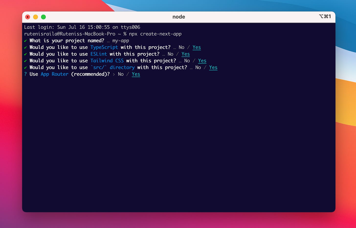
To bootstrap the development of my project I ran this command:
npx create-next-appI then picked the following settings:
I let the framework do the hard things like bundle splitting. This gives me more time for developing features instead of configuring a build system.
Illustration Credit: https://www.patterns.dev/posts/bundle-splitting
Using Next.js App Router
Next.js Layouts

The problem with creating layouts in React.js
React.js has no solution for layouts by default. Each developer can come up with a different way to do page layouts. In my experience, this can create problems in codebases over time.
Different approaches = inconsistent code.
Inconsistent code = slower development.
Slower development = your business will be less competitive.
Next.js solution for layouts
Next.js solves this problem by standardising layouts. Layouts and route groups are defined using folders and files. Not components. This creates a clean and systematic way to handle layouts.
Using Next.js layouts
Here’s how I used Next.js layouts for my app:
1. Define a root layout
This is where all of your components will be rendered. You can think of it as the trunk of a tree.
A trunk of a tree from which branches and leaves (React.js components) branch off.
2. Create route groups
Next.js route groups are designed to separate parts of your app that typically have different layouts.
For example:
/- (homepage)/admin/login/app
💡 Note: the square brackets
[steps]represent a dynamic URL. If you’ve worked with Next.js Pages Directory, you might be familiar with them.
They’re different from route groups as they identify which pages can have parameters.
3. Create custom layouts
For each route group, you can define a custom layout.
In my case, I have two different layouts:
- For the homepage, I render everything inside a horizontally centred container.
- I render a side navigation on the left and the app’s content on the right for the decision steps.
React Server and Client components
The web has swung from server-based to client-based development many times over the years.
Recently, however, architectures like PESPA have emerged. They enable you to granually specify which actions should be performed on the client and server.
See the illustration below:
How the “use client“ directive works
The problem with PESPA architecture
Although, in theory having complete control of client and server actions sounds excellent, in reality, implementing such apps can get incredibly complex.
The complexity comes from keeping two mental models in your head at the same time:
Node.js Server
No support for the browser APIs
window
onScroll
document
cookies
localStorage
Browser Client
No server-side rendering
HTML is rendered via JavaScript
With every feature you implement, you must consider browser and server functionalities and limitations.
RSC - React Server Components simplifies things
RSC simplifies this mental model. You don’t have to think about where and how your code will run.
With Next.js App Router, all React components are rendered as static HTML by default.
If you need dynamic functionality like event listeners, mutations or global state actions you can mark the component as a client component using the “use client“ directive.
Using Next.js next/font
The challenge with custom fonts is that they can have large bundle sizes.
Large bundle sizes can take a long time to load for your users. Slowly loading fonts can result in layout shifts for the first-time visitors of your app.
This is how a layout shift looks on a website:
💡 Tip: To test how fast your fonts are loading, you can clear the browser cache using a hard reload (
cmd + shift +r). This will remove all pre-saved assets from your browser, and you’ll be able to see the actual experience your first-time visitors get.
Using next/font for automatic size adjust
Here’s how you can setup next/font for custom fonts:
Step 1: Specify font paths in your root layout.
Step 2: Use the next/font CSS variable.
Result: This is how the font smoothing looks in the browser:
💡 Deep dive: The general principle for preventing layout shifts is to load and style fonts before the rest of your HTML and CSS loads. You can achieve a similar effect by including your fonts in a CDN at the top of your HTML file and having a separate
<style>tag to set your fonts.
Fonts first, styling second. Remember, an HTML file is read from the top to bottom, so whatever is specified at the top will be rendered first.
Setting up shadcn/ui UI framework
I wanted to test shadcn/ui framework for quite some time, so I used this project as an opportunity to try it out.
One of the reasons this framework became so popular so quickly is that it doesn’t force you into a particular abstraction. Instead, it downloads the source code of the components you need into your codebase.
This gives you complete control of how you build your UIs. You can extend the code in whichever you prefer if you need to change the look and feel of a UI component.
Shadcn/ui is a collection of the best components in the React ecosystem. It doesn’t try to reinvent the wheel.
For reference, here’s how a <Button /> component looks like in the codebase
And here’s the command I used to clone this component:
pnpm dlx shadcn-ui@latest add buttonTailwind CSS
If you worked with CSS in large codebases, you know maintaining it is a challenge. Coming up with CSS class names, naming conventions, and style isolation can make a codebase harder to scale as team members change and leave the project.
Tailwind’s solution
Tailwind solves all that by giving you a collection of mobile-first utilities. They can be easily customized to match your design system.
I set up Tailwind in my project using the Next.js CLI (see the start of this article).
To make Tailwind work with shadcn/ui I ran the following command:
pnpm dlx shadcn-ui@latest initWeb Accessibility
Web Accessibility is a broad term meaning that your app should be accessible to as many users as possible. This includes visually or motorically impaired users.
Web Accessibility is hard
If you’ve ever worked with web accessibility you know how hard it is. Properly implemented accessibility is perhaps one of the hardest things to do in frontend web development.
Dialogs, modals, and accordions = all have to be controllable with the keyboard, not just your mouse.
Radix makes accessibility easier
Radix is a headless UI framework meaning it has no styling. It makes building accessible apps easier by giving you UI primitives that are already accessible. All you need to do is to add your own CSS on top.
I built a side <Sheet /> component using Radix + shadcn/ui. Here’s a video showing how my app’s UI is controlled with a keyboard.
💡 Notice how the tab index focus goes to the sheet dialog after pressing ‘return’ and returns to the main page after hitting ‘escape‘.
Form validation
Forms have been a pillar of web development for more than 20 years. Learning how to validate your users' input is essential for a great user experience.
React Hook Form
In classical Multi-Page Apps, the form submit event was the primary form action to handle.
However, forms have become way more complex on the client (browser) side. They have to handle many events like onChange, onBlur, onFocus and others.
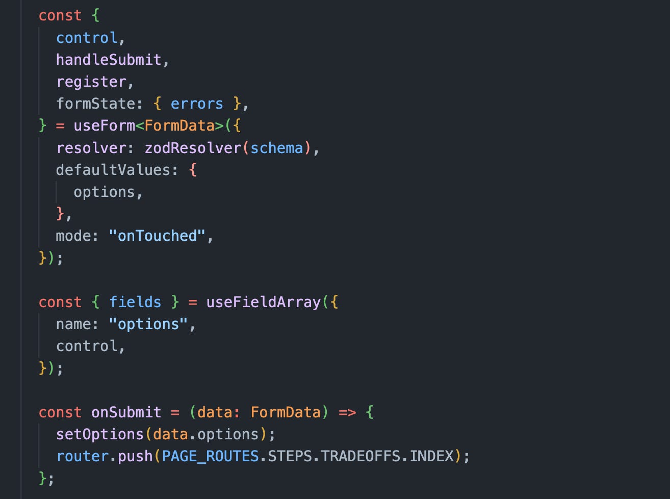
This is where React Hook Form comes in handy. It makes managing form state declarative and clear. Here’s an example from my app.
And here’s the code I used to make it happen:
Zod
React Hook Form is an excellent tool for handling the state of the form. However, it has limited capabilities when it comes to defining the shape of the data, you expect from the user.
Zod is a complementary addition to React Hook Form. It makes using declarative validators a breeze. The example above shows how simple defining minimum and maximum character lengths for a decision is.
Nested validation
Without declarative tools like Zod and React Hook Form, nested validation would be pretty complex. Check out these fields, for example:
There’re six factors to evaluate, and the number of options is dynamic. Solving this by manually checking each row would result in a code that’s hard to maintain.
Here’s how I used nested validation to create this validation:
Step 1: Define a type-safe schema
Step 2: Setup form state and events
Step 3: Render a list of fields in the JSX template.
The result is a simple-to-maintain solution that can handle complex validation. If I need to add more validation conditions in the future versions of the app, adding them is trivial, as I only need to update the validation schema shown in the first step.
Lazy loading for off-screen elements
Some elements in an app are only visible after a user performs an action. These elements can be loaded on demand. This pattern is called: “Import On Interaction”.

Sheets
Here’s an example of lazy loading in the gile.to app.
Notice how the JavaScript for the sheet element only gets loaded after clicking the “Examples” button.
And here’s the code to make it happen:
I’ve used React.js lazy imports. It automatically imports all the static assets (images, JavaScript and CSS) when the dialog is opened. This pattern is helpful as the app grows because I can only load the needed code on users’ requests.
Setting up unit tests
Unit tests are great for testing business logic for your apps. Here’s how I set them up in this Next.js project:
Step 1: Install the development dependenciespnpm i -D @jest/globals jest ts-jest
Step 2: Setup unit test commands in the package.json
Step 3: Add unit test files
💡 Insight In my experience, maintaining a complex .babel setup that handles both the main build of an app and unit tests can become hard as some dependancies become out of date. To solve this, I opted of using a TypeScript solution from t
s-jest.
Summary
In this issue, we’ve discussed how to pick features for an MVP version of the app. We’ve also talked about how to pick and use technologies that allow you to write robust, high-quality front-end code fast.
Thanks for reading! See you in the next issue.
Learning Resources
Next.js docs https://nextjs.org/docs
Patterns Dev https://www.patterns.dev/
shadcn/ui ui.shadcn.com
ts-jest - Delightful testing with Jest and TypeScript.
Nested validation using React Hook Form.


Wow, such in-depth explanation with nice and simple code samples. I'm saving this as a blueprint for the next time we start a new enterprise application from scratch. Like how you dive into things like FE perf (lazy loading), web accessibility, most tuts just make CURD apps whereas in real world we need to handle more sophisticated aspects like FE perf, css maintainability, babel setup, unit testing etc. Thanks for quality content !! Excited to read the next one !!